Network Performance Dashboard
UX Research • Workshop Facilitation • Product Design
-
Client
Sintrex
-
Role
Principal User Experience Consultant
-
Timeline
3 Month Project
-
Methods
+ UX discovery workshop + Stakeholder interviews + User interviews + Ethnographic observation + Ideation workshop + Card sorting + Information architecture restructure + Best practice research + Wireframe interactive prototypes + User interface design + Usability test + System Usability Scale
Project overview.
Our team was asked to help Sintrex, an IT Infrastructure Management Company that provides end-to-end IT solutions, improve the user experience of their performance graphs application.
“The problem we have is that we have so much data, but how do we communicate it so that it adds value to our users.”
– Alfred Clark, Sintrex Director
The goal.
To create a user friendly performance graph application which will increase the desirability and adoption of Sintrex’s services.
With a specific focus on:
Reducing customer support queries related to usability
Reducing the need for onboarding and training new users
Improved navigation and way-finding
Simplified use of terminology and language
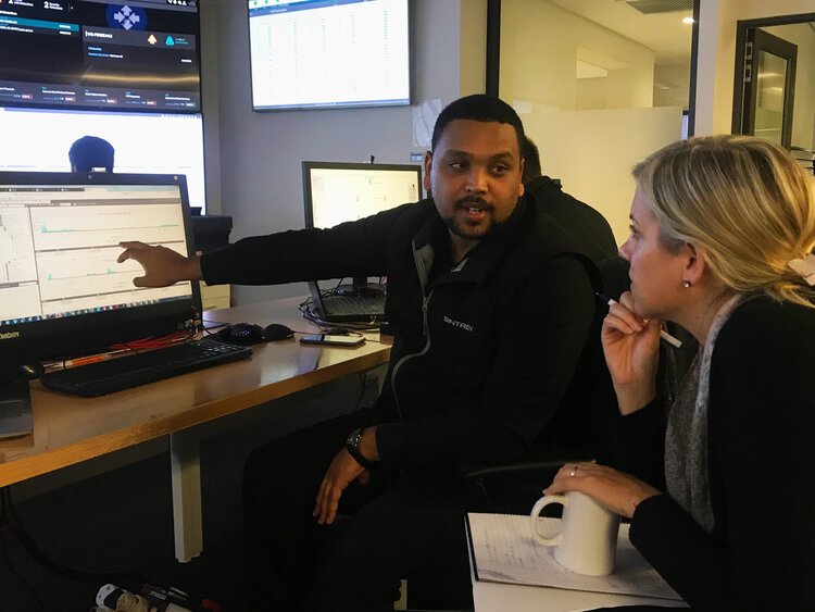
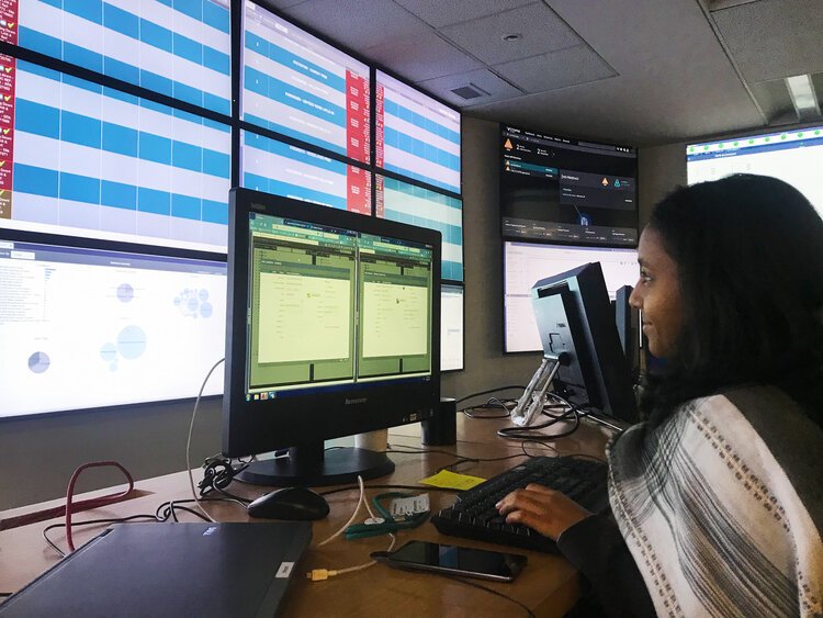
Ethnographic research and user interviews
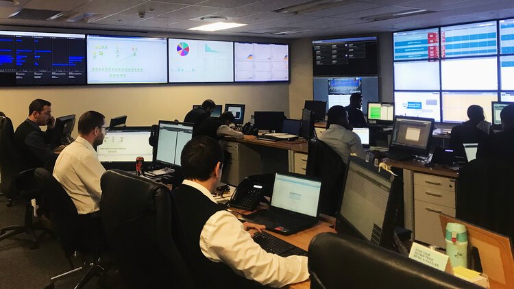
The process.
We began this project by facilitating a UX Discovery workshop with project stakeholders in order to understand the overarching business objective and product vision. This was followed by ethnographic interviews and observations in order to understand user needs and goals in the context of their environment.
We gathered the widespread information and synthesised these into key insights which we used as feedback for the business and as the starting point for design. Next, we facilitated an ideation workshop where, together with the team, we brainstormed ideas around the key insights gained during the research phase. The workshop focused on gathering as many ideas as possible and prioritising them for the next phase.
The next step was to conduct in-person and online card sorts to determine how to best simplify the complex navigation of the application, identify the information hierarchy as per user’s mental models as well as how each section should be named. This was done in order to create a common navigation structure that works for all users. Simultaneously, we researched best practices and methodologies for dashboard design and data visualisation.
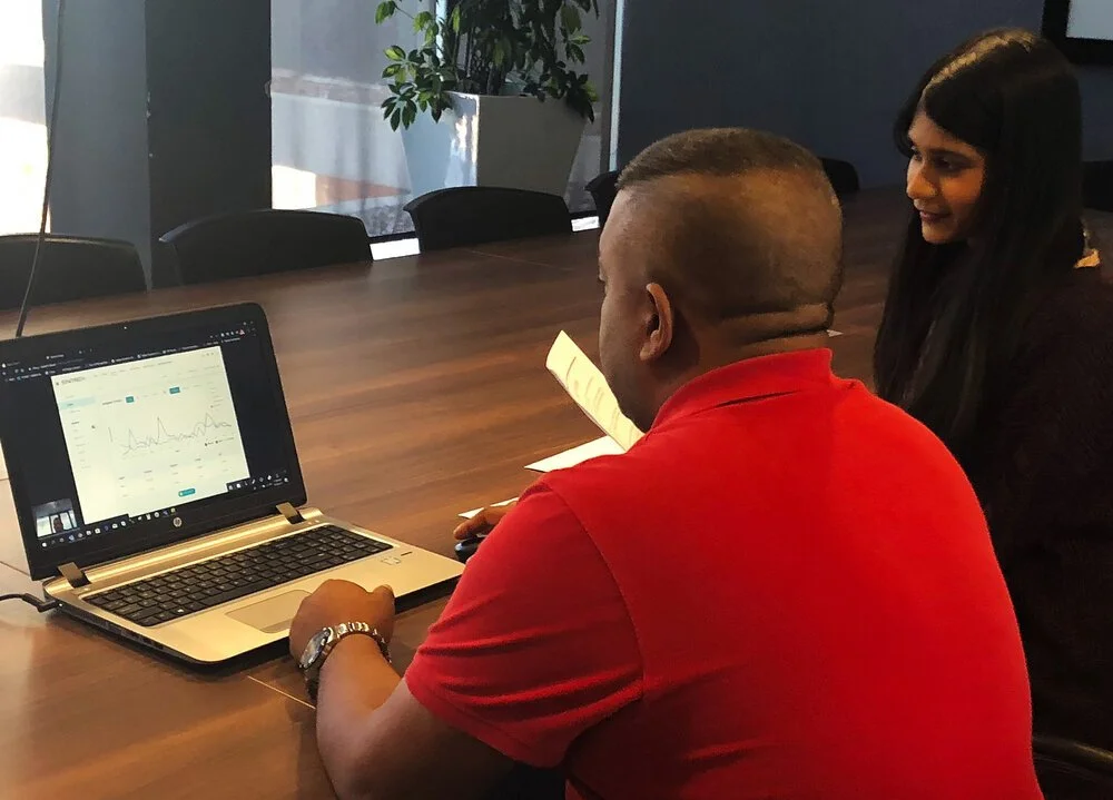
This all served as input for rough design iterations before producing high-fidelity designs to test with users. During the testing phase, we met users in their work environments and got them to complete a set of tasks using a prototype of the new design (which you can view here). After conducting the testing we asked participants to fill in a rating form which included a System Usability Scale questionnaire.
The design was then updated based on the learnings and findings from the usability tests before being handed over to the development team.
Sketch of wireframe
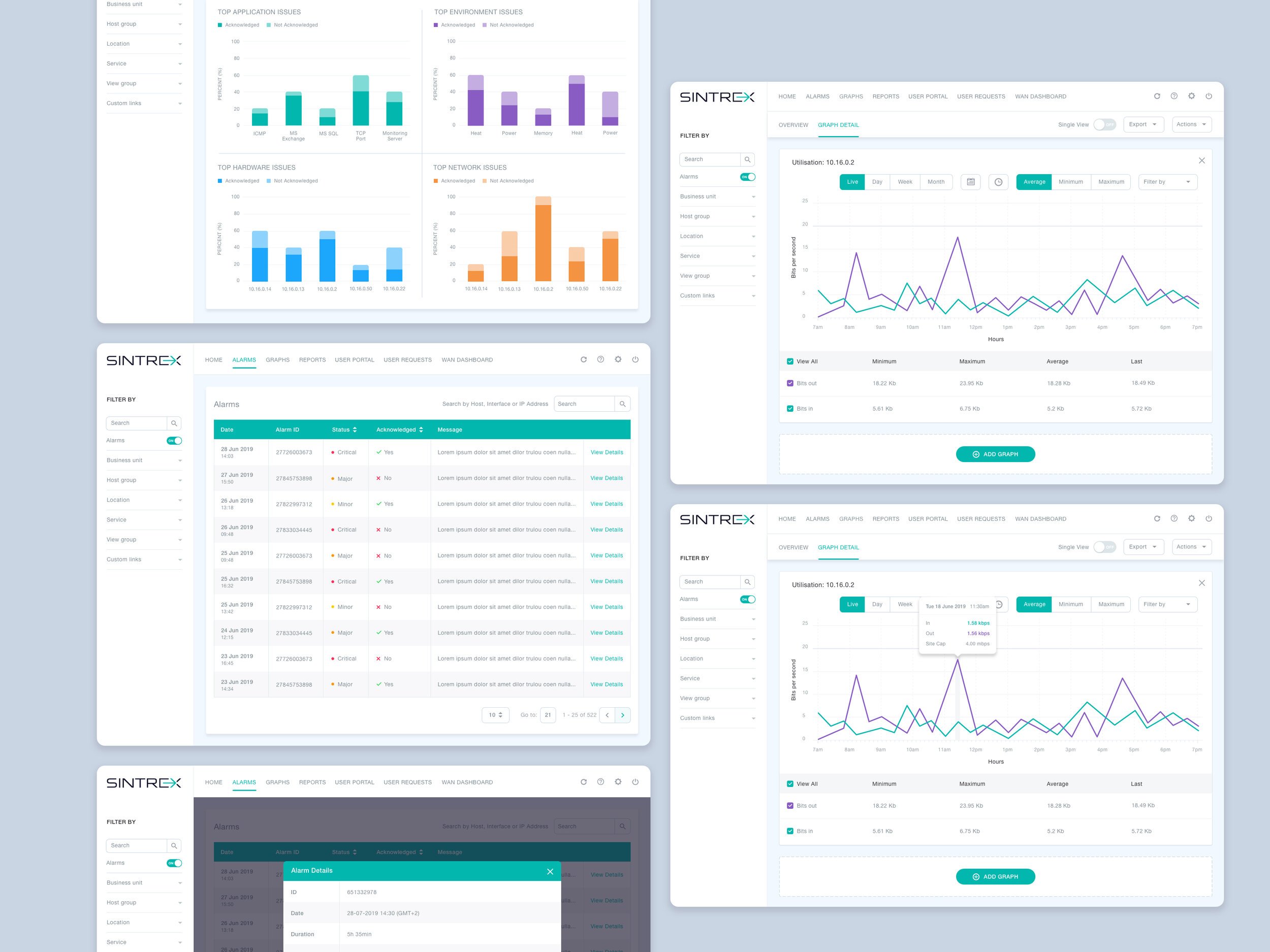
The re-designed dashboard
Usability testing
The result.
A re-designed application with an enhanced navigation, achieved with a simplified flow through the use of graphs as the interaction starting point, and the introduction of clear, concise use of language and simplified graph design.


